04 — UX Library · Internal
One studio, a team of UX designers, and every wireframe looked like it came from a different one. Each designer rebuilt inputs, dropdowns and tables from scratch, in their own grey, at their own level of finish, with states missing and directions mixed. Clients noticed. Onboarding meant weeks of “how do we draw this here”. The studio needed one wireframe language: neutral enough for any client, complete enough to ship a wireframe without inventing anything.
I went through the studio’s recent projects the way I would audit a product: what repeats, what contradicts, what gets skipped. Every project had built its own components again, from zero: the same dozen each time, each drawn slightly differently, and with the same things missing every time.
"The kit carries the standard, so the designer can carry the thinking."
The goal wasn’t to remove design decisions. It was to remove the ones teams shouldn’t have to make repeatedly. Common behaviors, states and constraints moved into the system — leaving designers more time for the problems unique to each product.
Success was defined by what stops happening.
Six decisions that turned a component file into a studio standard.
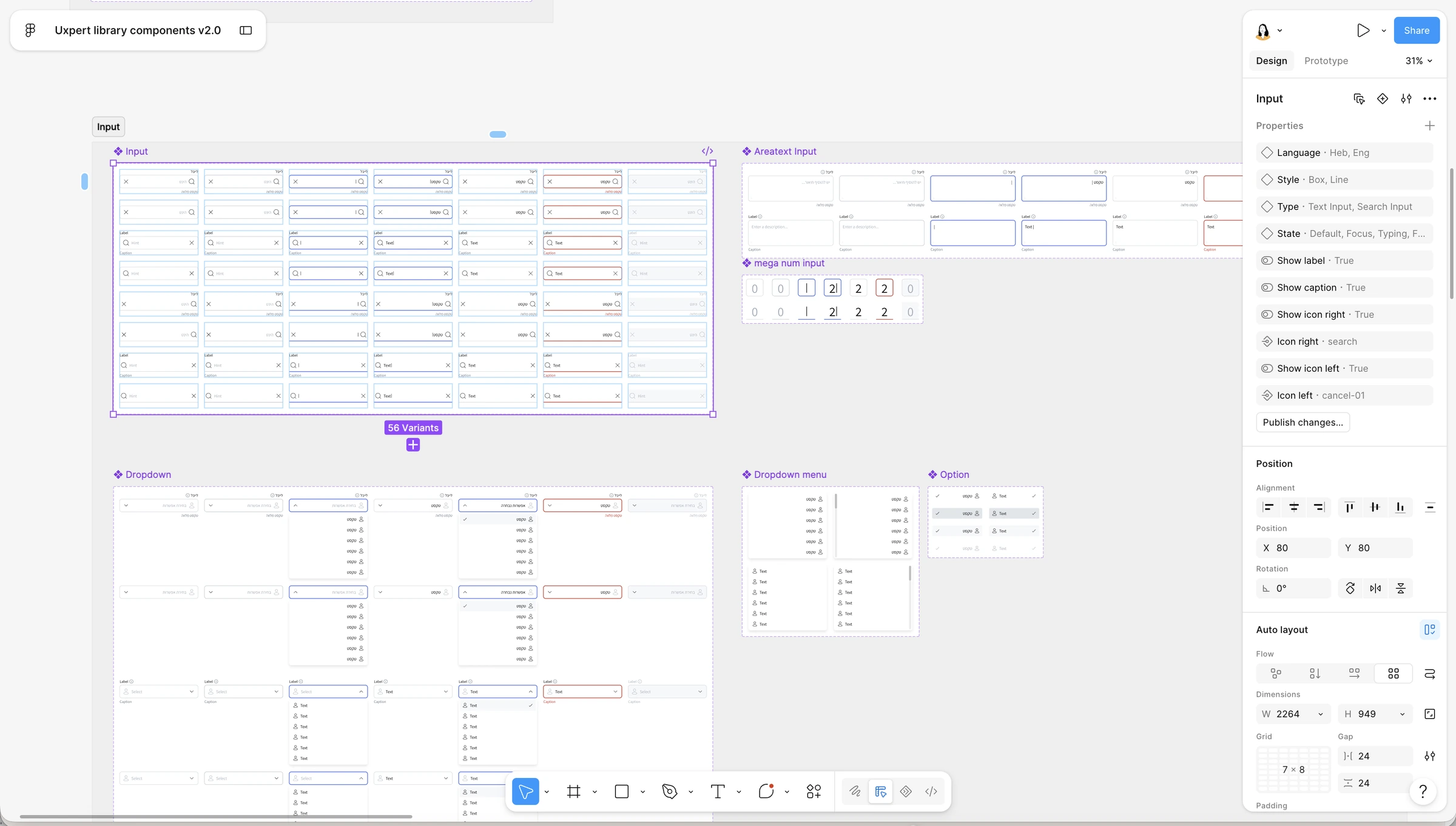
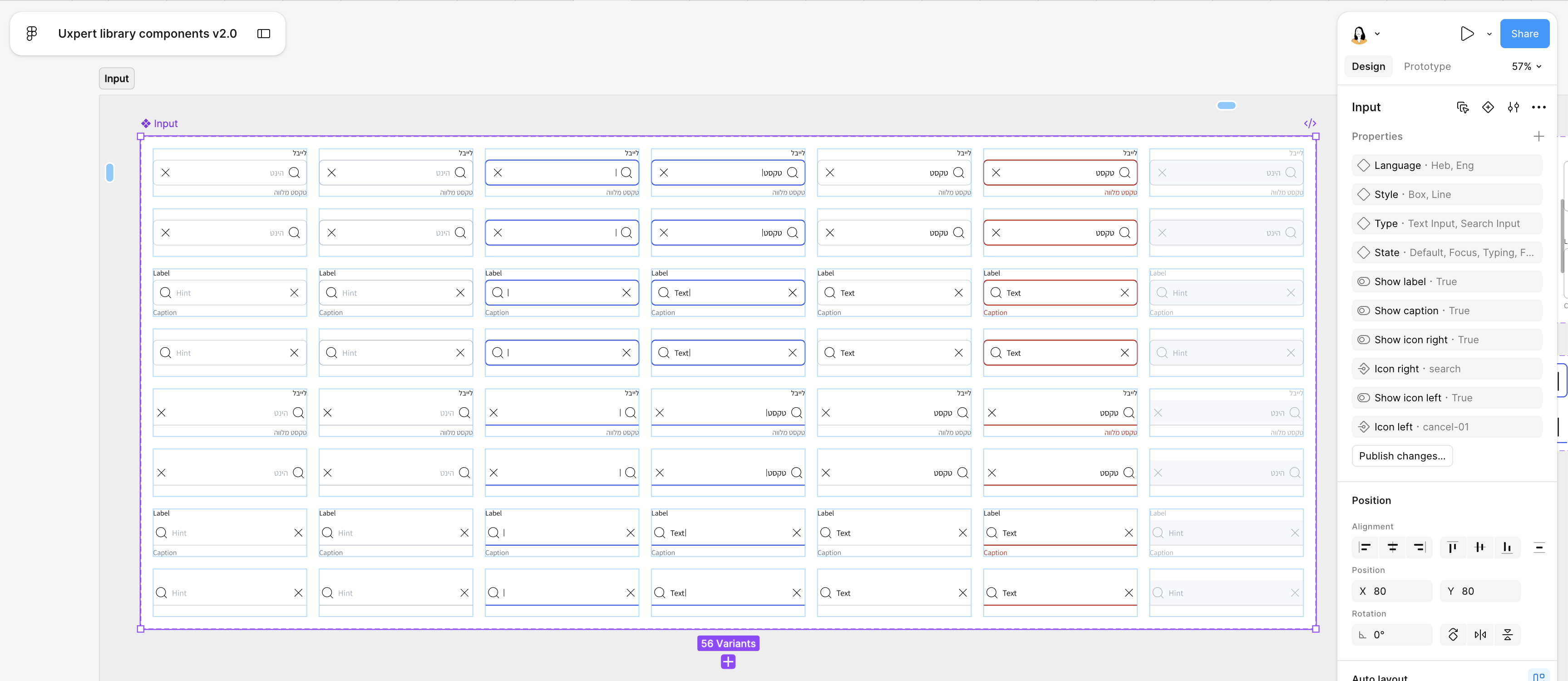
Error, disabled, focus and filled were the first things dropped when a designer was in a hurry, and the first things a developer asked about. Now they are built into each component as variants. You can’t place an input without its states coming along.
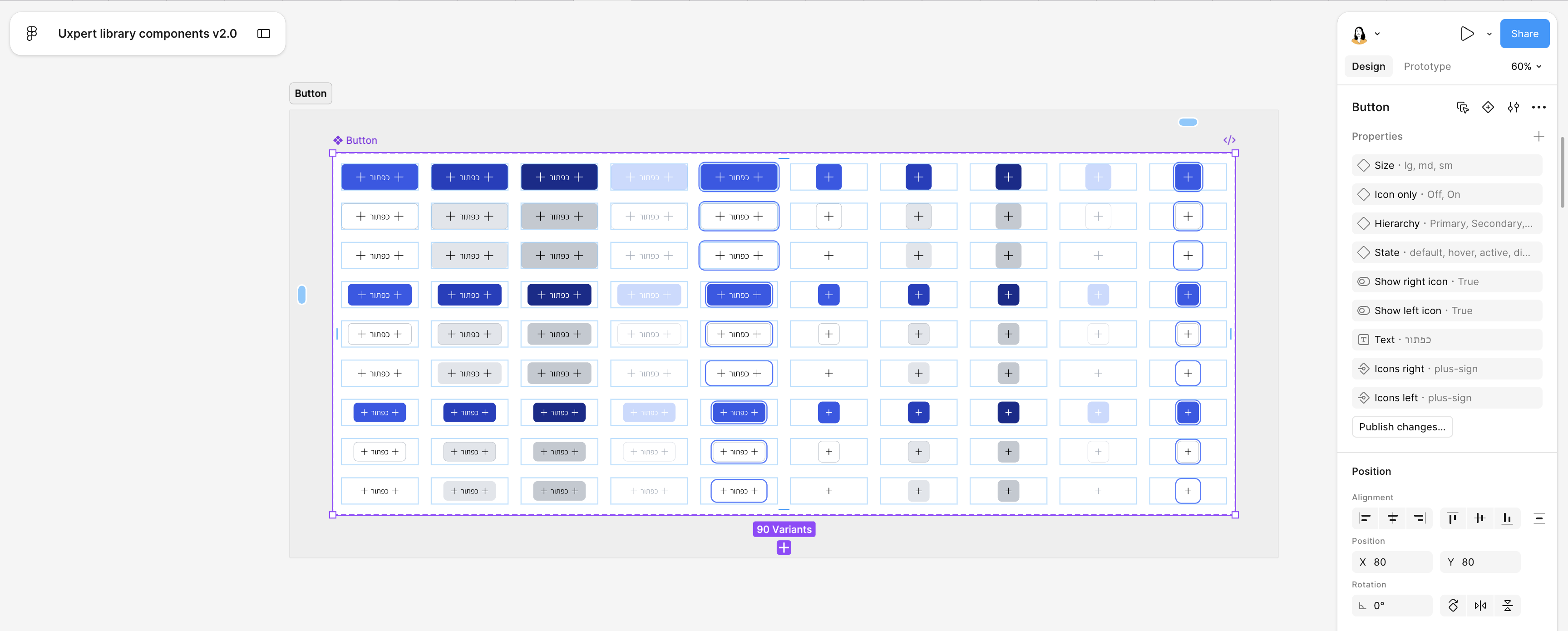
Half the studio’s work is Hebrew, half is English, and most files are both. Every component exists as an RTL and an LTR pair, with Hebrew and English type set side by side, so a mixed-direction wireframe is a switch, not a rebuild.
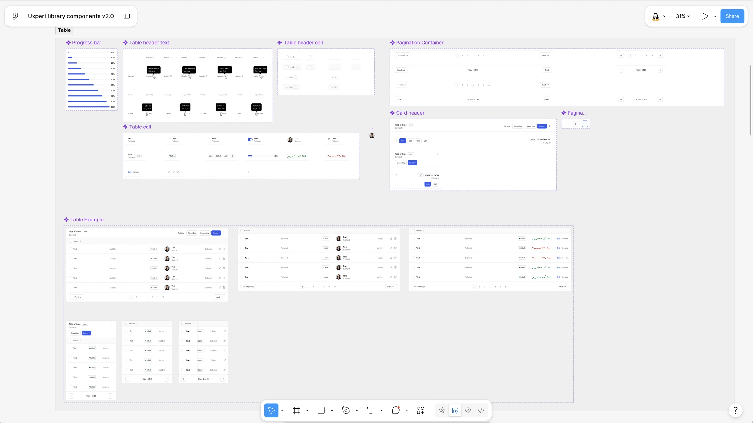
Tables are where wireframes go to die. Header cells, cells, tooltips, avatars, progress bars and pagination were built as parts, and then assembled into ready table examples. A designer picks a table, not forty rectangles.
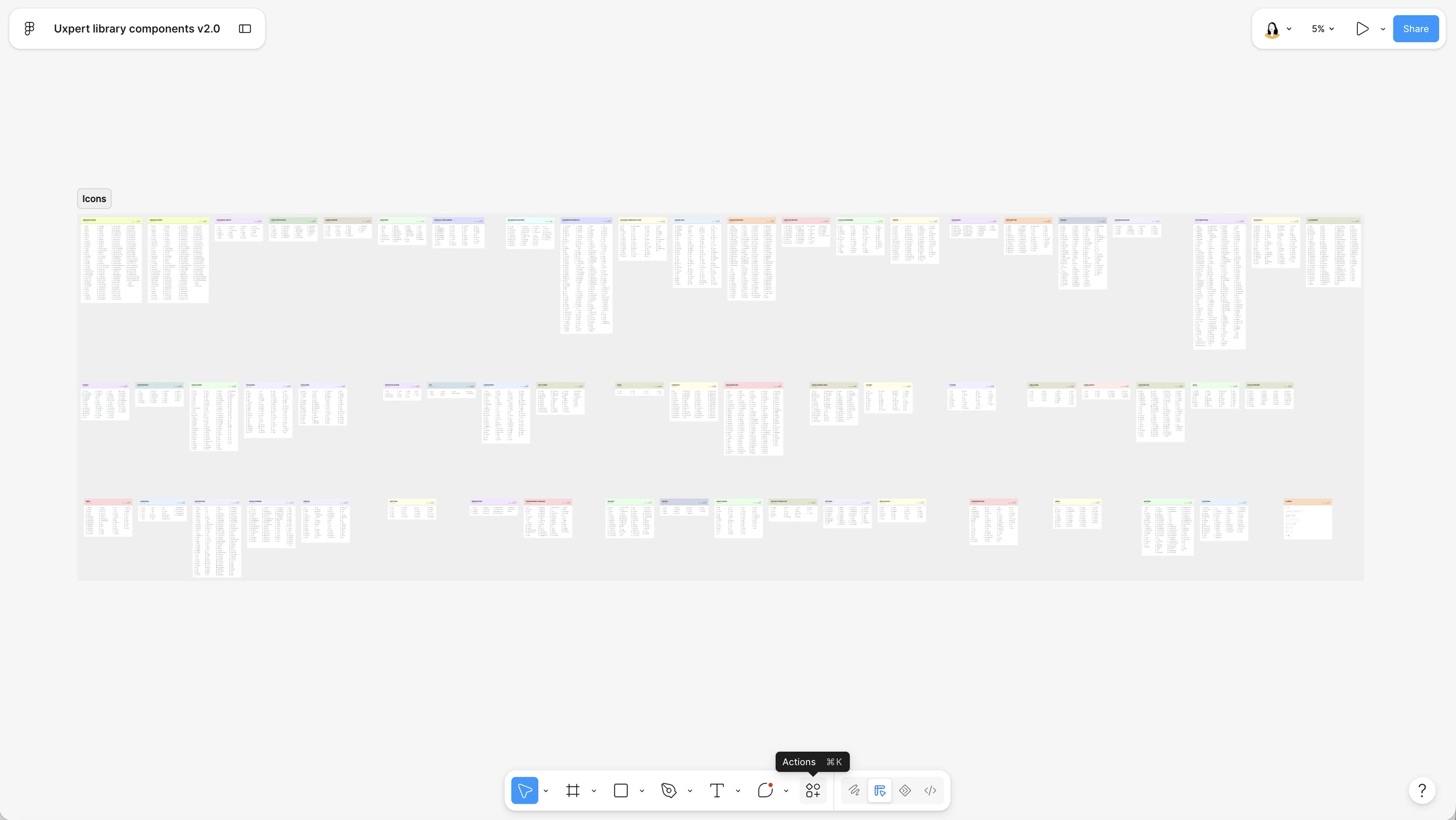
Six layout grids from 1920 to 360 plus container grids, one type scale in both scripts, and a full icon set, all in the same file. Nothing to import, nothing to hunt for, nothing to be inconsistent about.
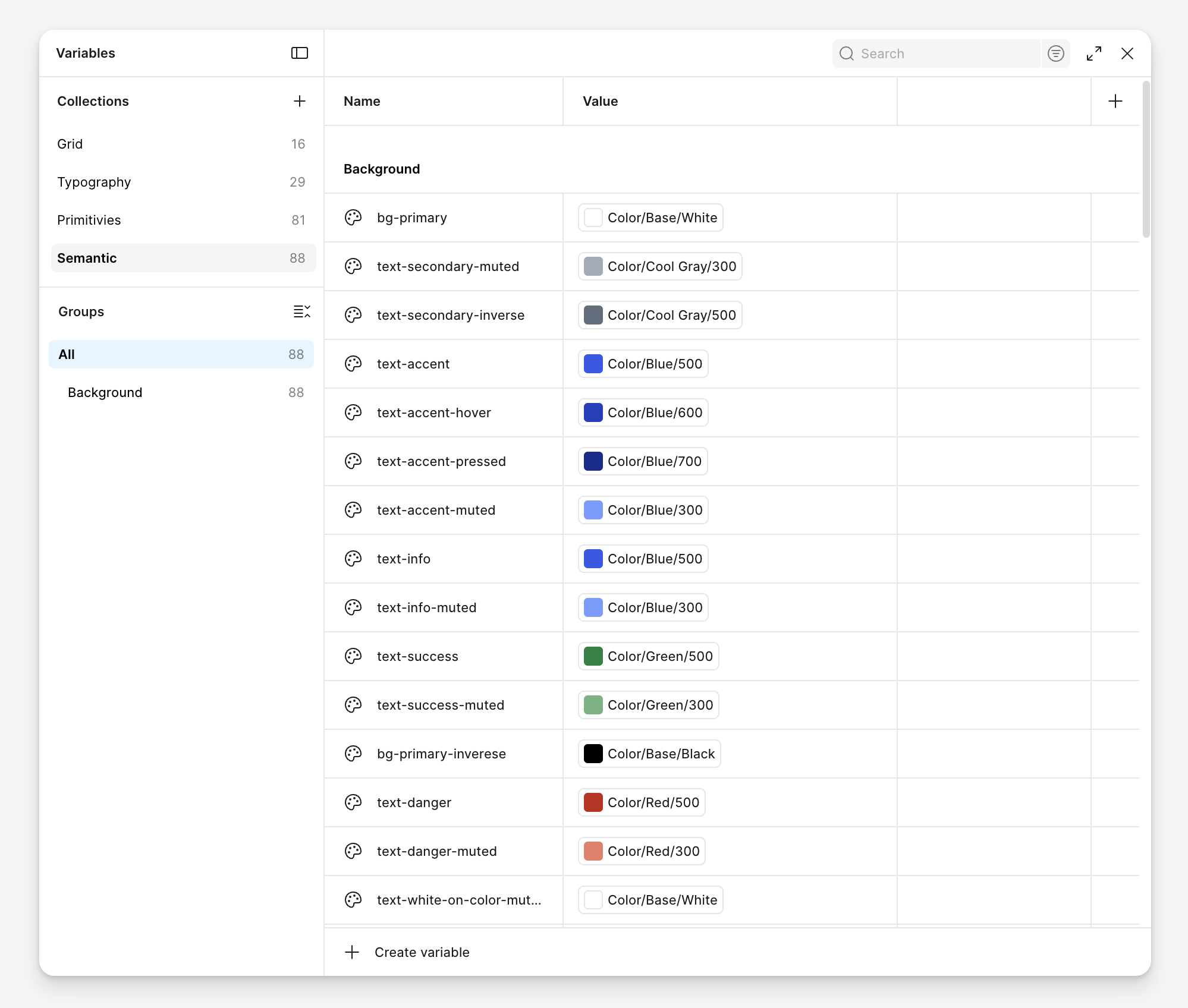
Nothing in the kit is a hard-coded value. Four variable collections, 214 tokens: grid, typography, primitives, and a semantic layer that points at them, so a component asks for text-accent, not Blue/500. Change a token once and every wireframe in the studio moves with it. That is how the library stays one version instead of forty copies.
A wireframe has to read like a product without being mistaken for one. So the palette is grey and one blue, the type is a workhorse, and nothing is styled enough to be argued about. Clients discuss flows and content. The visual design comes later, from whoever owns it.
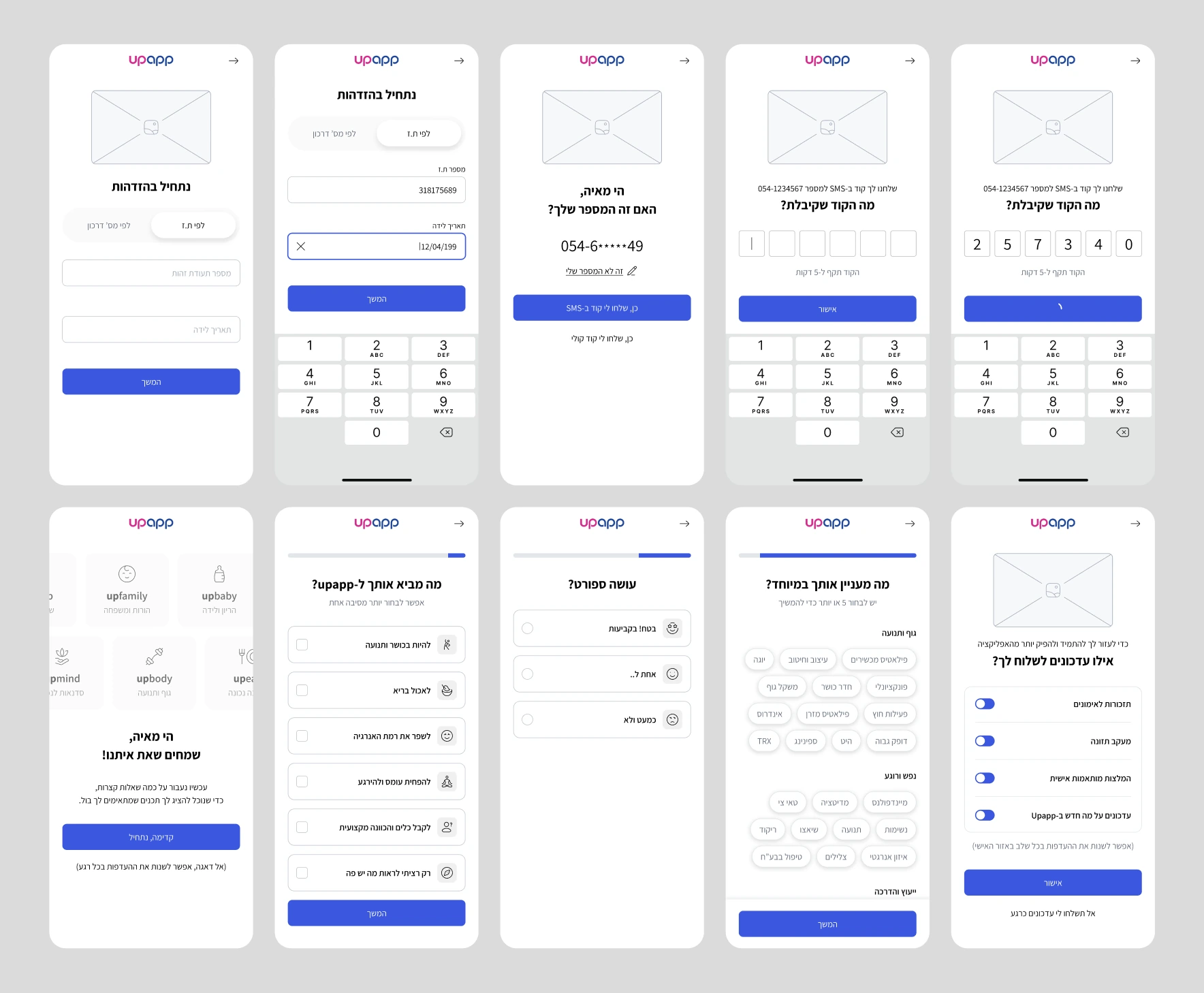
What changed is what stopped being discussed. Reviews moved from pixels to flows, clients see one UXpert level whichever designer they get, and the library became the place where the studio’s way of working actually lives.
Initiated, designed and built the library in Figma, rolled it out across the studio, and keep maintaining it: every new project need becomes a component, and every component becomes the standard.