03 — GigaSpaces · Enterprise
Three mental models. One platform.
Listen · the one-minute story
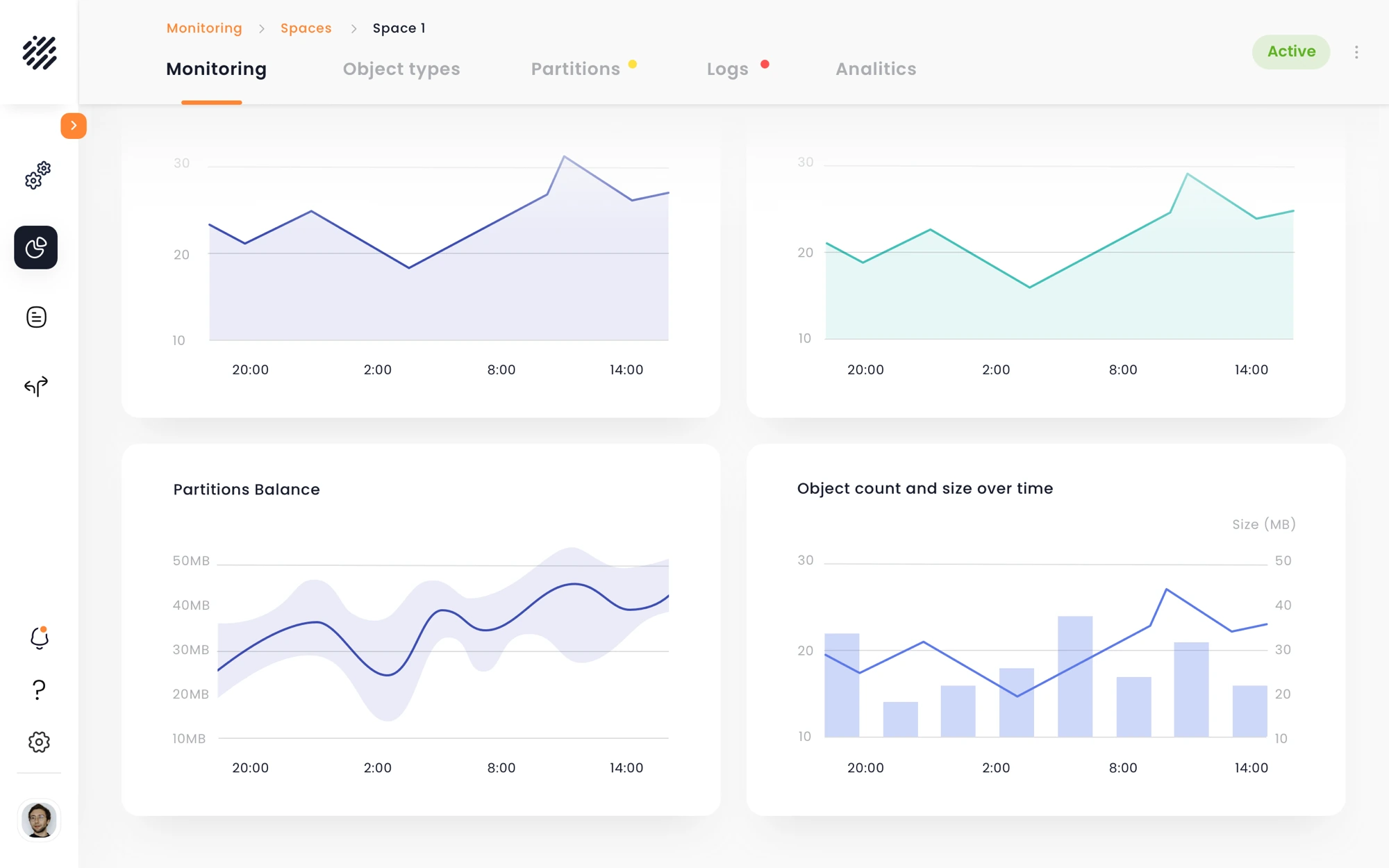
The same complex system had to support very different ways of working. Users needed to monitor system health, investigate issues, and configure how the system behaved — often moving between all three. The challenge was to reveal the right level of context at the right moment, without losing orientation or exposing everything at once.
Discovery started by mapping the core operational flows across the platform — from understanding system health to identifying issues, investigating components, and taking action. Different tasks required different levels of information, but the same need kept emerging: users had to know what mattered and where to look next.
"Don't simplify the system. Control when its complexity appears."
The opportunity was to create a consistent path through the platform: start broad, surface what needs attention, progressively narrow the problem, and reveal technical detail only when it becomes relevant.
I explored how that investigation flow could remain consistent across different modules without forcing them into identical interfaces. The direction was a shared interaction language — common hierarchy, navigation and behaviors, adapted to the data and actions of each area.
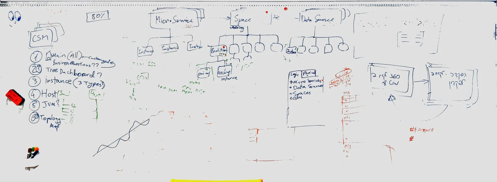
Success was defined before the build — in learning curves, not feature counts.
Seven decisions carried the architecture from the whiteboard to 52 screens.
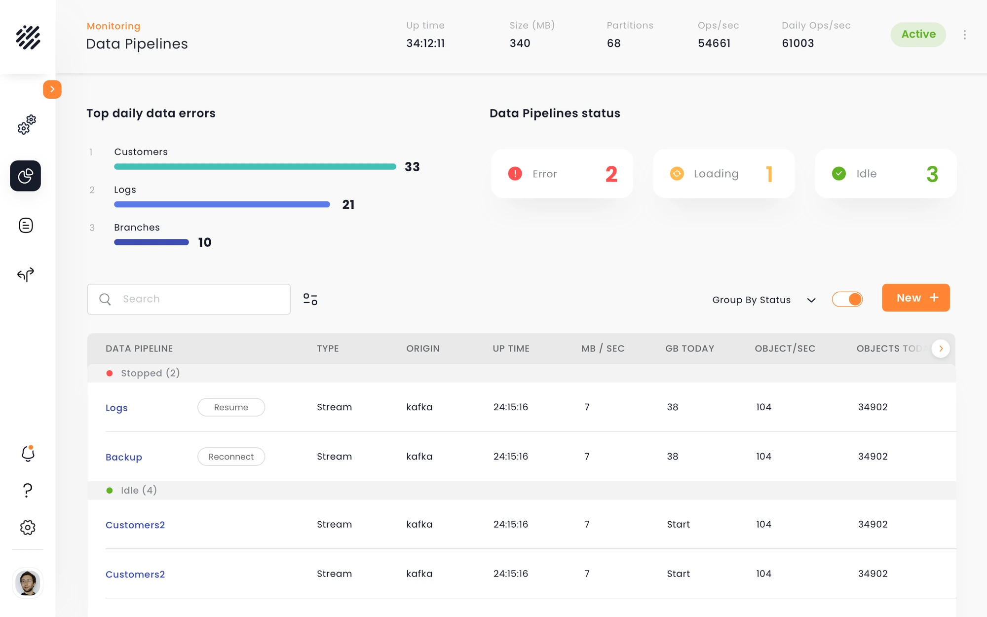
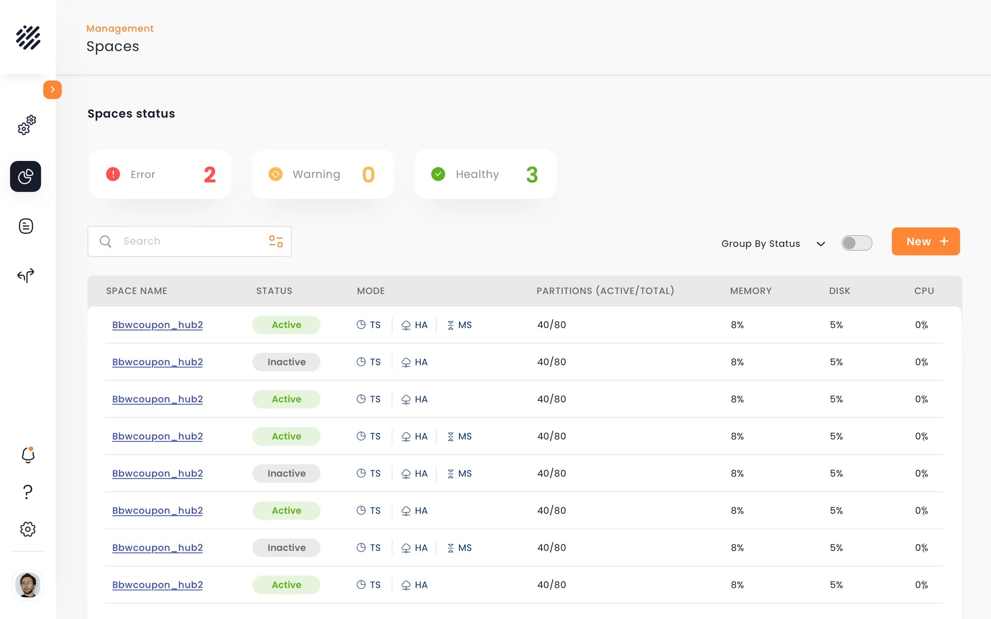
An operations system can expose thousands of records, and nobody comes in to read all of them. They come in with three questions: is something wrong, where, and what needs me now. So key screens open as an investigation, not a dashboard: status signals first (Error 2 · Loading 1 · Idle 3), the ranked few next, the full table last. And the signals aren't decoration: click a status, and the table below narrows to it.
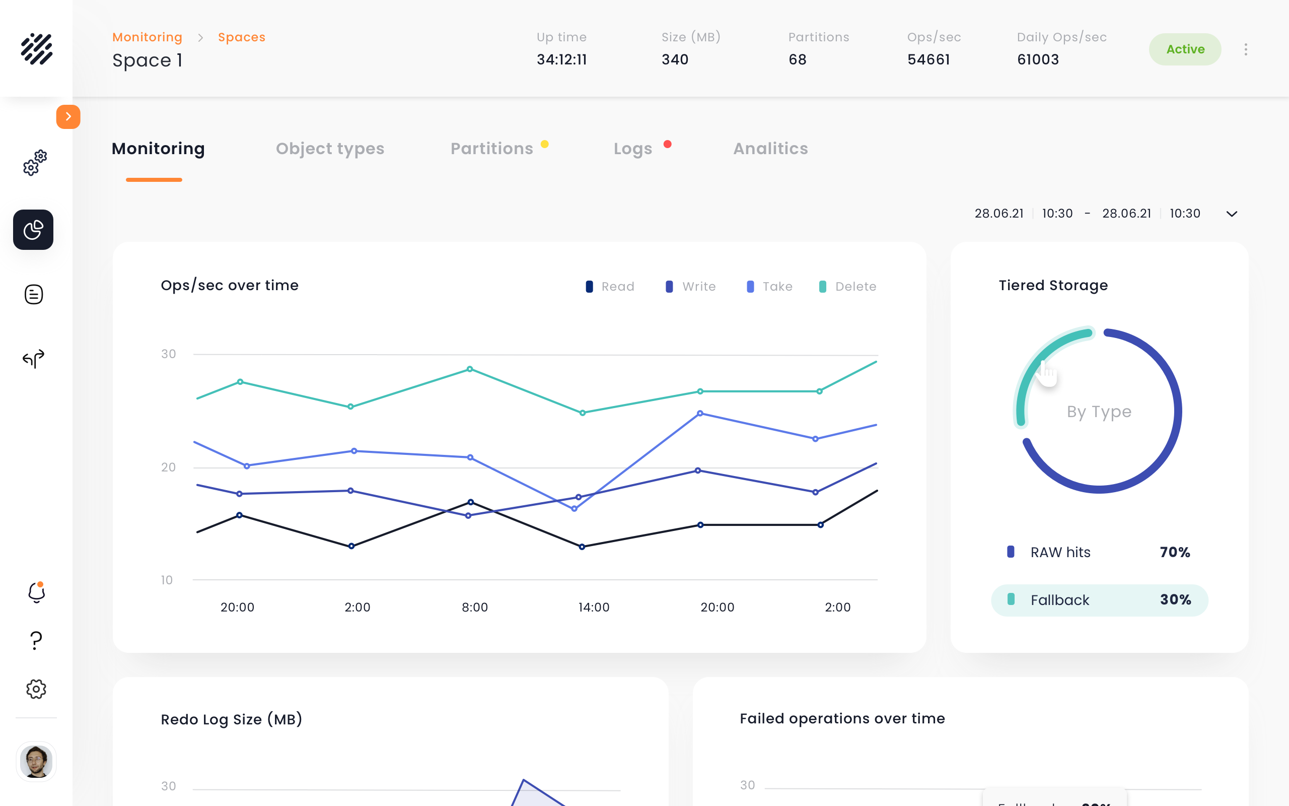
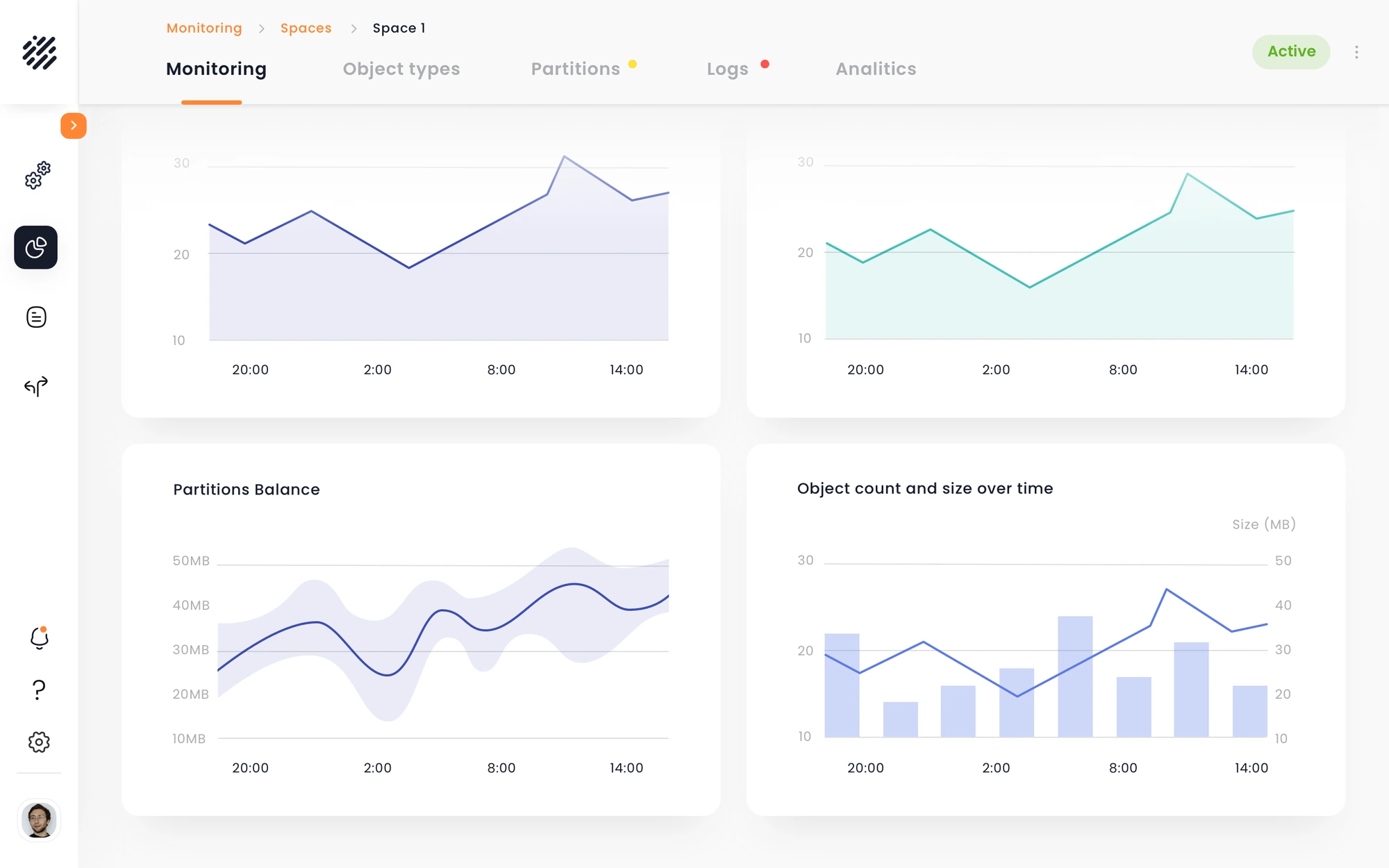
Charts in an operational product shouldn't be dead ends. Every visualization is an interaction layer over the data underneath it: hover a donut sector and its legend lights up, click it and the table opens already filtered to that slice. See a signal, select it, investigate its records. The distance between noticing something and acting on it shrank to one click.
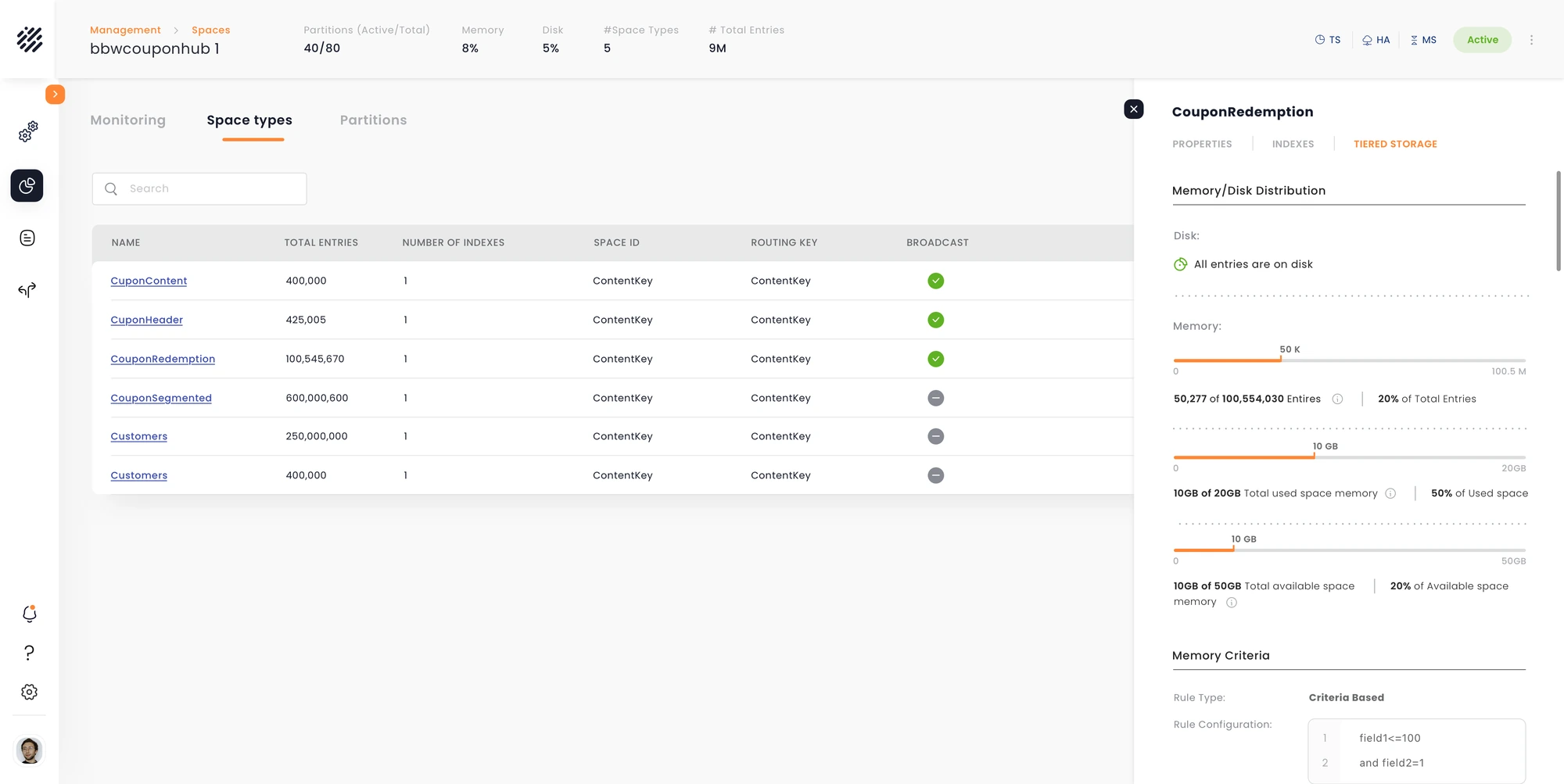
Inspecting components usually means several of them, one after another. A page per component turns that into open, inspect, back, relocate, repeat. Instead, a non-modal detail blade: the selected row stays visible in its table, the blade opens depth beside it, and picking the next row simply updates the blade. Drill-down became continuous inspection.
Enterprise tables aren't lists of records. They're the workspace. So the same dataset can be reshaped three ways, depending on what the user already knows. Grouping by status turns a flat inventory of 24 pipelines into Error, Loading and Idle, with dividers, counts, and the grouped column removed so nothing shows twice. We didn't simplify the data. We made the complexity navigable.
The longer a screen gets, the harder it has to work so the user doesn't lose their place. Every pattern here solves that one problem: the header collapses on scroll but keeps the essentials, table headers stick after fifty rows, the first two columns stay frozen while you scan metrics sideways, and breadcrumbs plus the entity header hold your position in the hierarchy. Depth is the blade's job. This is about length.
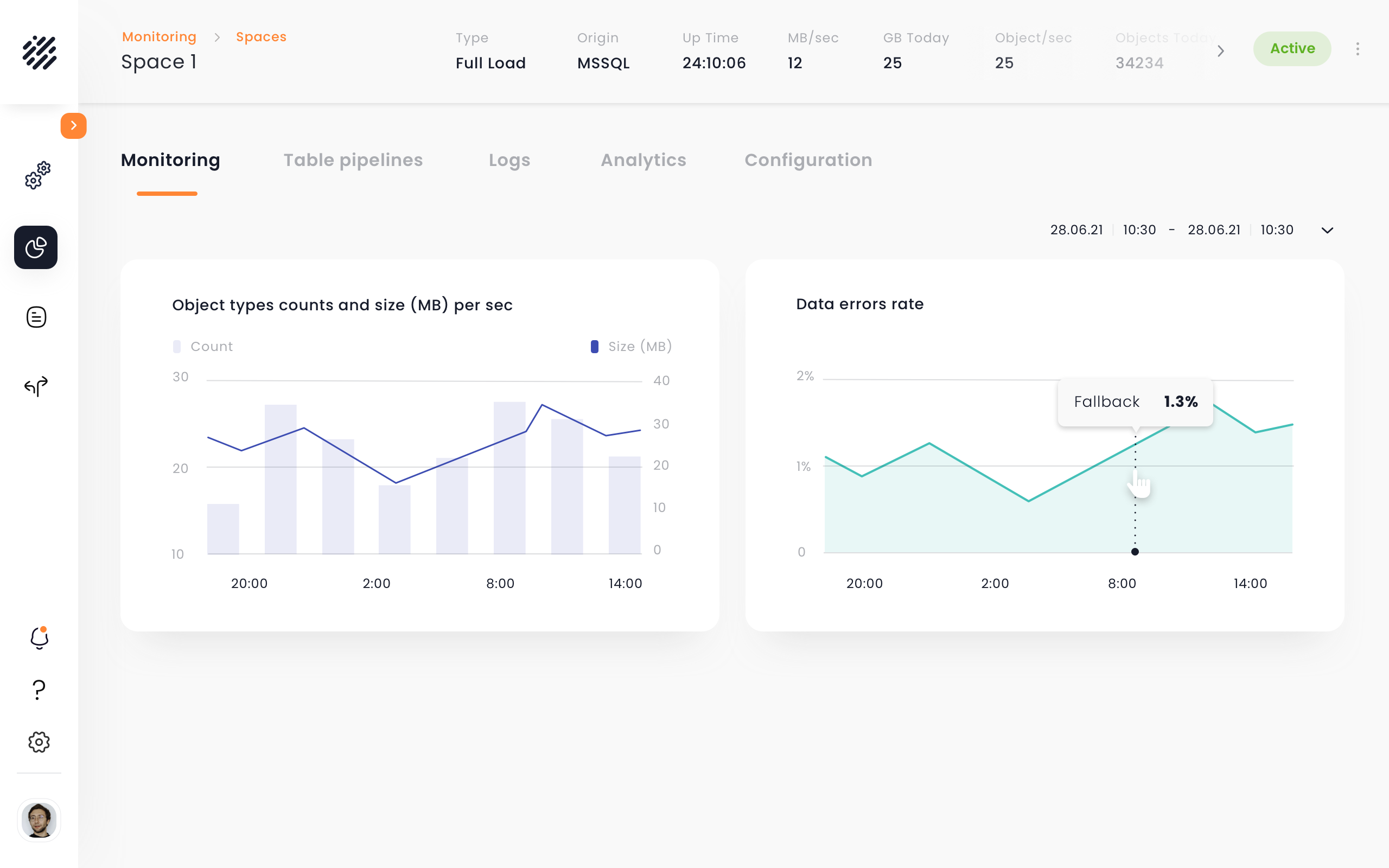
The timeframe belongs to the screen, not the platform. Default is the last 24 hours; change it on one monitoring view and only that view changes. So you can ask what happened to this space in the last two hours without silently shifting the clock for everything else. Local predictability over global magic.
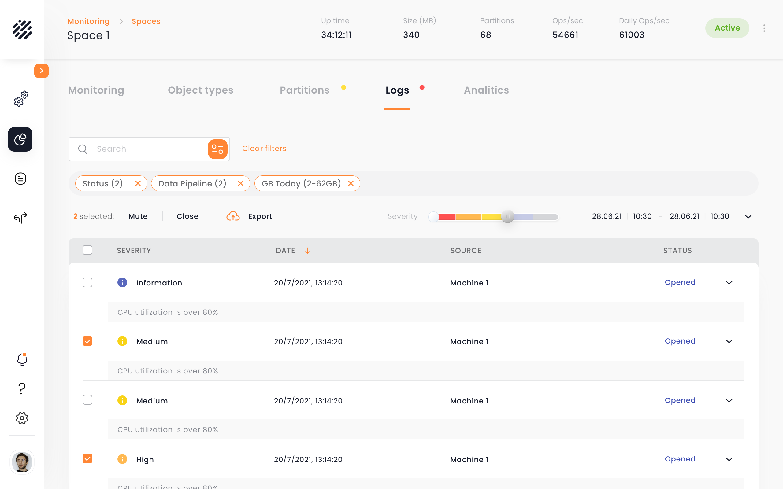
With nothing selected, the toolbar shows information and global actions. Select one row or ten, and it changes: 2 selected · Mute · Close · Export. Progressive disclosure at the level of actions. In a product with this many capabilities, the interface adapts its controls to the moment instead of showing dozens of them up front.
Full UX platform designed from scratch across 4 major modules. 52 screens for Data Pipelines alone. Complete UI kit. Designed for 4 distinct user types with different technical backgrounds.
The platform shipped before the AI era. Today, the three languages would get a fourth speaker — AI inside the monitoring, not bolted above it.
Related alerts cluster into one incident, deduplicated, with a suggested root cause attached. The inbox stays readable at 3am.
Natural language over event logs: 'why did pipeline X slow down at 2am?' — answered with the graph that proves it.
Models flag drifting metrics before thresholds fire. The executive's traffic light turns yellow before it turns red.
Every resolved incident drafts its own fix documentation. The next engineer starts from the answer, not the search bar.
UX design from discovery to delivery, working alongside the VP UX on product definition across the platform's modules. I drove research, flows, wireframes, client alignment, development guidance, and QA, while directing the UI work delivered by a second designer.